Re-design of Typical Roofing Sites
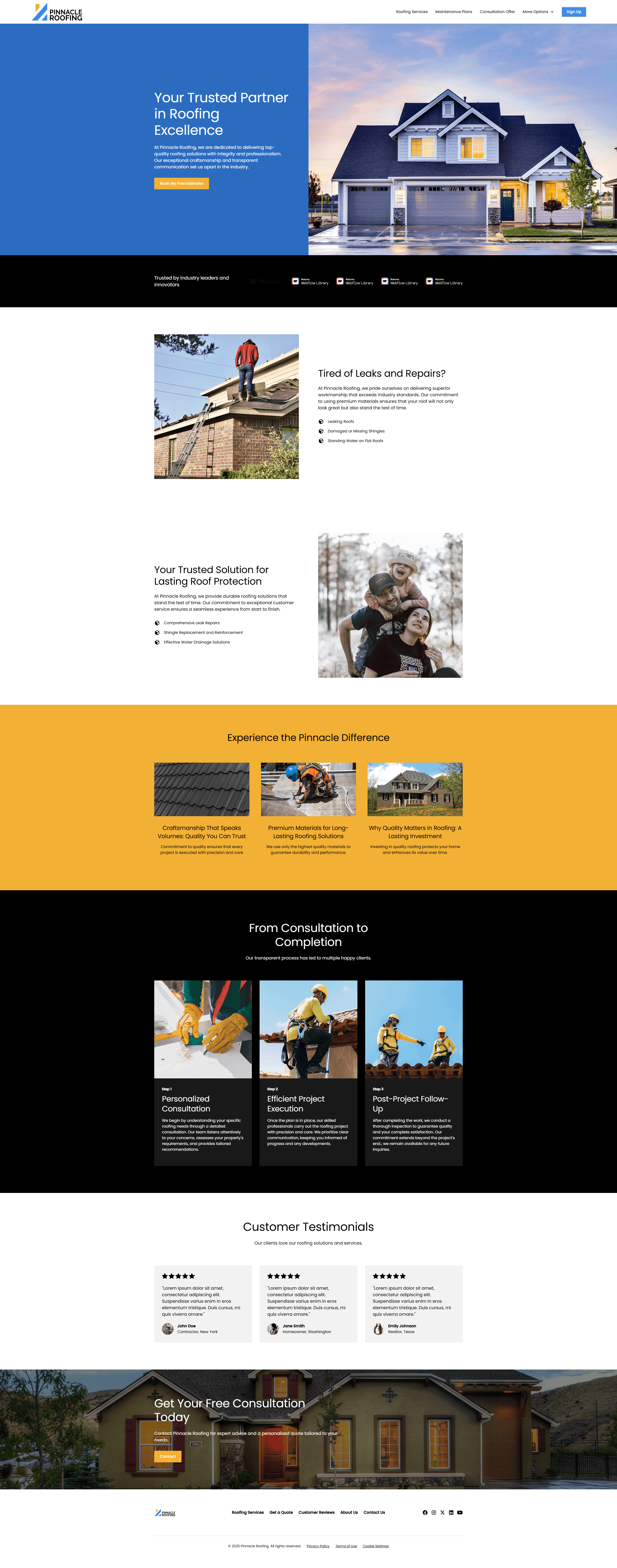
Pinnacle Roofing
The Problem
Before the redesign, Pinnacle Roofing’s web presence was:
Unbranded and generic – It looked like any local roofing company, with no visual identity or storytelling.
Text-heavy, low impact – Minimal imagery, unclear messaging, and no visual proof of craftsmanship.
Hard to trust – No social proof, no standout reviews, and a layout that didn’t build confidence.
Zero conversion flow – No compelling calls to action or funneling toward quotes.
Branding Boost
Visual Identity: Strong use of dark blues, crisp whites, and accent colors = trust and professionalism.
Copywriting: “Built to Last. Backed by Trust.” anchors the brand story in durability and integrity.
Service Clarity: Residential and commercial services are broken down visually with icons and scannable sections.
Business Results Potential
This kind of redesign sets the stage for major wins:
Lead Generation: Clear, repeated CTAs increase inquiries.
SEO Growth: Clean structure and schema-friendly layout.
Credibility: Looks more like a market leader than a neighborhood handyman.
Final Word
Pinnacle Roofing’s new site is a perfect example of how strong branding + clean UX turns a service business into a trust-first powerhouse. Webflow gave them the platform — now they’re positioned to dominate.
Project Information
Client:
Pinnacle Roofing
Category:
Re-design of Typical Roofing Sites
Completed on:
July 30, 2024
Website
Share On: